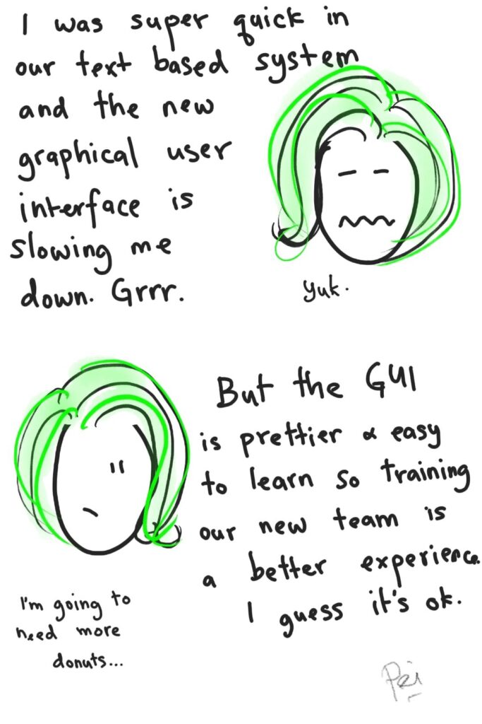
“I hate it! I hate it! I HATE IT!!”
The ‘integration’ and ‘upgrade’ had gone horribly wrong.
Delays after delays, broken functionalities, poor communication and angry passengers had left the airline contact centre operatives angry and miserable.
My friend was a very senior multi-lingual agent who dealt with high value customers, and had been sharing her tale of woe.
Apart from the project delivery issues above, she had a particular beef with the change in user interface… which had changed from a text based interface to a graphical one.
She had mastered all the keyboard shortcuts in her twenty year service, and was a total demon at work – able to deal with passenger cases incredibly efficiently.
Now, her AHT (Average call Handling Time) had tripled, and she was NOT HAPPY.
I totally get it.
I hated it too, when Office 2007 came out with its fancy “ribbon” on the menu 😣
All the most common keyboad shortcuts from the previous version had been burned into my brain as I worked on my (unpublished) book and various lengthy reports and documents.
ARGH WHY DID THEY DO THAT?!
But it’s not all about me, you see.
It’s about user adoption, and accessibility.
If I can just get out of my Misery Bucket and look at the bigger picture, I can see why the change was necessary; I may not like it, but I understand it.
Next time, when I feel miffed at a change I perceive to be a personal attack, I remind myself to look harder for the real reason for the change.
Of course, I still think that Microsoft should have compensated me for my loss of efficiency and wasted braincells of keyboard shortcuts that can never be replaced 😑
Even a truck load of 🍩 isn’t enough to appease me.
Ok, maybe just a little.
😋
#OnThePeiroll
#ProjectManagement
#UserAdoption
#Communication

